Spawning modal dialogs in Team Messaging


Modal dialogs are windows that developers can cause to be opened and that float above a conversation. While a modal dialog is open, users cannot interact with any part of the team messaging interface. Dialogs can be forcibly closed by the end user, or be closed naturally following a successful interaction with a dialog's contents.
Responding to an interactive messaging event
Dialogs can only be spawned (or opened) in response to an interactive messaging event, or more specifically when a user clicks an adaptive card button with the action type of Action.Submit. Do remember that Dialogs cannot be opened via the REST API!
To spawn a dialog, have your application respond to a RingCentral outbound webhook with a 200 HTTP status code, return a Content-type of application/json and finally, set the contents of the response to one of the dialog payloads below.
Code walkthrough: open dialog
The example Javascript below is an expansion to the Walkthrough example to demonstrate a simple Add-in app which opens a dialog in response to a user's submit event.
// This handler is called when a user submit data from an adaptive card
app.post('/user-submit', function (req, res) {
    console.log( "Received user submit event." )
    var body = req.body
    if (body.data.path == 'new-card'){
      var card = make_new_name_card( body.data.hellotext )
      send_card( body.conversation.id, card)
      res.status(200).end();
    }else if (body.data.path == 'update-card'){
      var card = make_hello_world_card( body.data.hellotext )
      update_card( body.card.id, card )
      res.status(200).end();
    }else if (body.data.path == 'open-dialog-card'){
      let dialog = {
          type: "dialog",
          dialog: {
              title: "This is a dialog in a card",
              size: "small",
              iconURL: "https://somedomain.com/icon.png",
              card: {
                  type: "AdaptiveCard",
                  version: "1.3",
                  $schema: "http://adaptivecards.io/schemas/adaptive-card.json",
                  body: [{
                    type: "TextBlock",
                    text: "Hello dialog.",
                    wrap: true,
                    size: "ExtraLarge",
                    weight: "Bolder"
                  }]
              }
          }
      }
      res.status(200);
      res.setHeader('Content-Type', 'application/json');
      res.end(JSON.stringify(dialog))
    }else if (body.data.path == 'open-dialog-iframe'){
      let dialog = {
          type: "dialog",
          dialog: {
              title: "This is a dialog in an iFrame",
              iFrameURL: "https://www.ringcentral.com"
          }
      }
      res.status(200);
      res.setHeader('Content-Type', 'application/json');
      res.end(JSON.stringify(dialog))
    }
});
Dialog payloads
The response to an interactive messaging event contains the following elements:
| Parameter | Description |
|---|---|
title |
The title that will be displayed in the header of the dialog. |
size |
small/medium/large. The size of a model dialog. |
iconURL |
The icon that will be displayed in the header of the dialog. |
card or iframeURL |
The contents of the dialog. Either an adaptive card or an iframe respectively. |
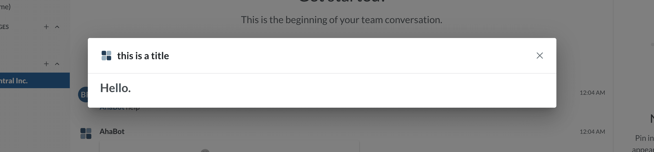
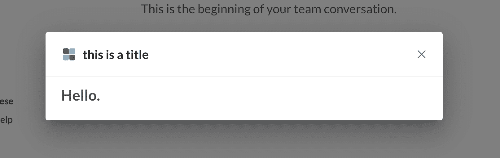
Adaptive card dialogs
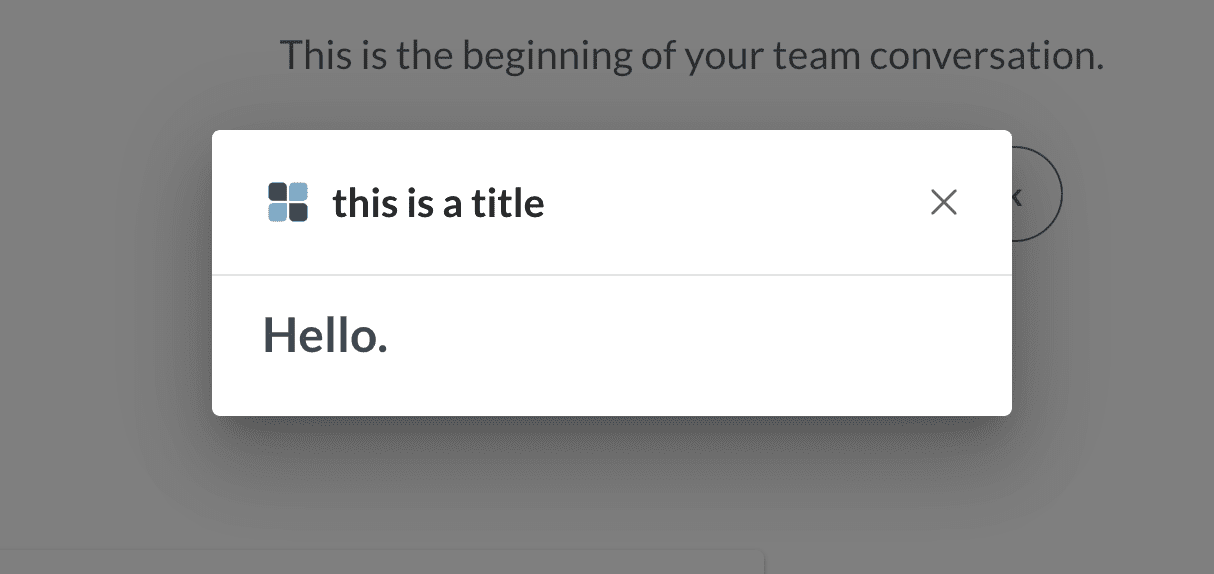
{
    "type": "dialog",
    "dialog": {
        "title": "This is a dialog card",
        "size": "medium",
        "iconURL": "https://www.kindpng.com/picc/m/255-2554719_a-generic-square-placeholder-image-with-rounded-corners.png",
        "card": {
            "type": "AdaptiveCard",
            "$schema": "http://adaptivecards.io/schemas/adaptive-card.json",
            "version": "1.3",
            "body": [
                {
                  "type": "TextBlock",
                  "text": "Hello.",
                  "wrap": true,
                  "size": "ExtraLarge",
                  "weight": "Bolder"
                }
            ]
        }
    }
}
The above payload will produce a dialog that appears as follows:
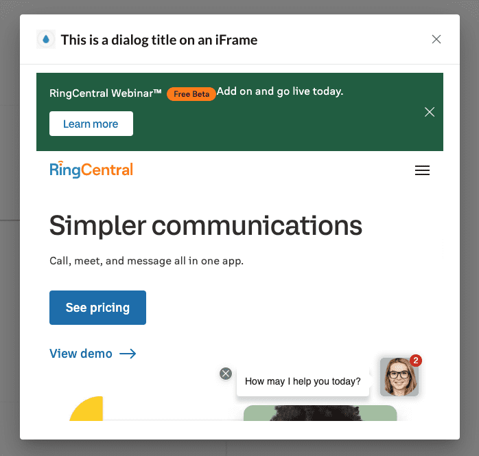
iFrame dialogs
{
    "type": "dialog",
    "dialog": {
        "title": "This is a dialog on an iFrame",
        "size": "medium",
        "iconURL": "https://www.kindpng.com/picc/m/255-2554719_a-generic-square-placeholder-image-with-rounded-corners.png",
        "iframeURL": "https://www.ringcentral.com/"
    }
}
The above payload will produce a dialog that appears as follows:
Approving iFrame URLs in Developer Console
For security purposes, all iFrame URLs used within modal dialogs must be specifically approved by the developer. Wildcards can be used in the formation of these URLs to make their configuration easier.
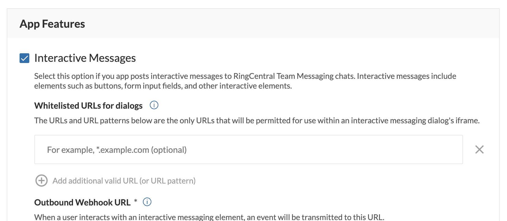
Examples
| URL | Description |
|---|---|
www.somedomain.com |
Approve all URLs from www.somedomain.com |
*.somedomain.com |
Approve all subdomans from somedomain.com |
Passing data from an adaptive card to a dialog
To trigger a dialog to appear, one must issue a response to an incoming interactive messaging event (as described above), which itself is triggered by a user clicking a button associated with the Action.Submit action. Given that there could be any number of buttons associated with the Action.Submit action, how does a developer identify the button clicked, and how does a developer optionally transmit other key information associated with that button click?
Data is transmitted to an add-in via an incoming message event. The data that is transmitted comes from one of two sources:
- Input form elements contained within the card, e.g.
Input.Text,Input.Date,Input.Time,Input.Number,Input.ChoiceSetandInput.Toggle. - Values contained within the
dataelement that is a sibling of theAction.Submitelement.
For example, the following card will transmit two key/value pairs in the payload of the incoming interactive messaging event:
{
    "type": "AdaptiveCard",
    "actions": [
        {
            "type": "Action.Submit",
            "title": "View",
            "data": {
                "staticValue": "foo"
            }
        }
    ],
    "$schema": "http://adaptivecards.io/schemas/adaptive-card.json",
    "version": "1.5",
    "body": [
        {
            "type": "Input.Text",
            "placeholder": "Enter a value",
            "label": "A form element",
            "id": "textField"
        }
    ]
}
The two key/value pairs will be:
staticValue= "foo"textField=
Consult our documentation on input and interactivity to better understand the payload of an interactive messaging event and how to access the data that is transmitted to your add-in.
Dialog attributes
Title and icon
The title and icon of the dialog are required fields. The ic
Sizes
Small Dialog
Medium Dialog
Large Dialog