Adaptive Card layout and design

The Adaptive Card framework provide a robust system for laying out content in a way that is adaptive, accessible and localizable.
One of the advantages of leveraging the Adaptive Card framework is the extensive tools and documentation available to developers to assist them in designing, and implementating adaptive cards in their application. What follows below is a high-level overview of the kinds of elements this framework provides to help developers unfamiliar with Adaptive Cards in understanding the core concepts.
If you are already familiar with the core concepts behind Adaptive Cards, we recommend you consult the official Adaptive Cards documentation.

Adaptive Card Designer
The Adaptive Card designer provides an easy-to-use, drag-and-drop interface for designing and building adaptive cards.
Containers
Containers provide the basic building blocks for laying out text, images and forms. The basic container elements include:
- Container. A collection of related elements.
- ColumnSet and Column. A way of laying out content from left to right.
- FactSet. A way of displaying a collection of name/value pairs.
- ImageSet. A way of displaying multiple images at once in a gallery format.
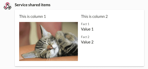
Sample card with various containers
{
    "attachments": [
    {
        "type": "AdaptiveCard",
        "$schema": "http://adaptivecards.io/schemas/adaptive-card.json",
        "version": "1.3",
        "body": [
        {
            "type": "Container",
            "items": [
            {
                "type": "ColumnSet",
                "columns": [
                {
                    "type": "Column",
                    "width": "stretch",
                    "items": [
                    {
                        "type": "TextBlock",
                        "text": "This is column 1",
                        "wrap": true
                    }
                    ]
                },
                {
                    "type": "Column",
                    "width": "stretch",
                    "items": [
                    {
                        "type": "TextBlock",
                        "text": "This is column 2",
                        "wrap": true
                    }
                    ]
                },
                {
                    "type": "Column",
                    "width": "stretch",
                    "items": [
                    {
                        "type": "TextBlock",
                        "text": "This is column 3",
                        "wrap": true
                    }
                    ]
                }
                ]
            }
            ]
        }
        ]
    }
    ]
}
The above card when posted to RingCentral, will appear as shown below:
Elements
Elements comprise the core content of a card. They are static and uneditable. They include these basics:
- TextBlock. A basic string of text. The entire string can styled in various ways, or portions of text can be styled using a simplified version of markdown.
- RichTextBlock and TextRun. A sequence of strings, each with their own style characteristics that are concatenated together.
- Image. An image referenced by a URL.
- Media. A video, audio file or other form of media (not an image).
- ActionSet and Action. A button that triggers an action or card behavior.
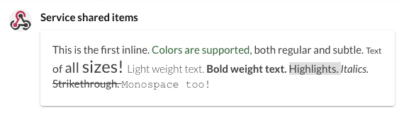
Sample rich text card
{
    "attachments": [
    {
        "$schema": "http://adaptivecards.io/schemas/adaptive-card.json",
        "type": "AdaptiveCard",
        "version": "1.3",
        "body": [
        {
            "type": "RichTextBlock",
            "inlines": [
            {
                "type": "TextRun",
                "text": "This is the first inline. "
            },
            {
                "type": "TextRun",
                "text": "Colors are supported,",
                "color": "Good"
            },
            {
                "type": "TextRun",
                "text": " both regular and subtle. ",
                "isSubtle": true
            },
            {
                "type": "TextRun",
                "text": "Text ",
                "size": "Small"
            },
            {
                "type": "TextRun",
                "text": "of ",
                "size": "Medium"
            },
            {
                "type": "TextRun",
                "text": "all ",
                "size": "Large"
            },
            {
                "type": "TextRun",
                "text": "sizes! ",
                "size": "ExtraLarge"
            },
            {
                "type": "TextRun",
                "text": "Light weight text. ",
                "weight": "Lighter"
            },
            {
                "type": "TextRun",
                "text": "Bold weight text. ",
                "weight": "Bolder"
            },
            {
                "type": "TextRun",
                "text": "Highlights. ",
                "highlight": true
            },
            {
                "type": "TextRun",
                "text": "Italics. ",
                "italic": true
            },
            {
                "type": "TextRun",
                "text": "Strikethrough. ",
                "strikethrough": true
            },
            {
                "type": "TextRun",
                "text": "Monospace too!",
                "fontType": "Monospace"
            }
            ]
        }
        ]
    }
    ]
}
The above card when posted to RingCentral, will appear as shown below:
Actions
Actions, which are grouped under and ActionSet, create buttons which can trigger interactivity and other card behaviors.
- Action.OpenUrl. Trigger a URL to be opened.
- Action.ShowCard. Reveal a hidden card.
- Action.Submit. Submit a form containing input elements.
- Action.ToggleVisbility. Show/hide target containers, elements and/or inputs.
Inputs
Input elements comprise all of the form elements that allow users to input data into a card, and then later submitted to underlying service via the Action.Submit action.
- Input.Text. A text field.
- Input.Date. A date-picker.
- Input.Time. A time-picker.
- Input.Number. A text field with built-in validation for accepting numbers.
- Input.ChoiceSet. A pull-down menu or a set of radio buttons.
- Input.Toggle. A checkbox or toggle.
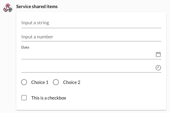
Sample card with input elements
{
    "attachments": [
    {
        "$schema": "http://adaptivecards.io/schemas/adaptive-card.json",
        "type": "AdaptiveCard",
        "version": "1.3",
        "body": [
        {
            "type": "Input.Text",
            "placeholder": "Input a string",
            "id": "text"
        },
        {
            "type": "Input.Number",
            "placeholder": "Input a number",
            "id": "number"
        },
        {
            "type": "Input.Date",
            "id": "date"
        },
        {
            "type": "Input.Time",
            "id": "time"
        },
        {
            "type": "Input.ChoiceSet",
            "choices": [
            {
                "title": "Choice 1",
                "value": "Choice 1"
            },
            {
                "title": "Choice 2",
                "value": "Choice 2"
            }
            ],
            "placeholder": "Select a menu item",
            "style": "expanded",
            "id": "menu"
        },
        {
            "type": "Input.Toggle",
            "title": "This is a checkbox",
            "id": "toggle"
        }
        ]
    }
    ]
}
The above card when posted to RingCentral, will appear as shown below:
Additional resources
There exists in the Adaptive Card developer community a great number of useful resources that provide much more comprehensive guidance on how they can be designed and laid out.